University of Maryland
Maryland Research Magazine
Maryland Research was developed to promote the University of Maryland’s research activities to industry and government. I designed the inaugural issue and three others before moving to Michigan where I continued as a freelancer.
One of the the biggest challenges was how to make the research and researchers visually compelling. I often developed concepts and hired illustrators or photographers to visualize them. In the wireless security feature story, a team of high-tech thieves plan to break through a company’s defenses only to be thwarted by its high-tech defenses. The material science feature, “It's a Material World” features portraits by John Consoli of University of Maryland researchers photographed in an homage to the photographer Irving Penn inside a triangular shape. In our photographs, we used sheet metal to create a high-tech like space that reflected light in wonderful ways. The floor beneath researchers was sprinkled with objects related to their research.
Clarice Smith Performing Arts Center Fundraising Brochure
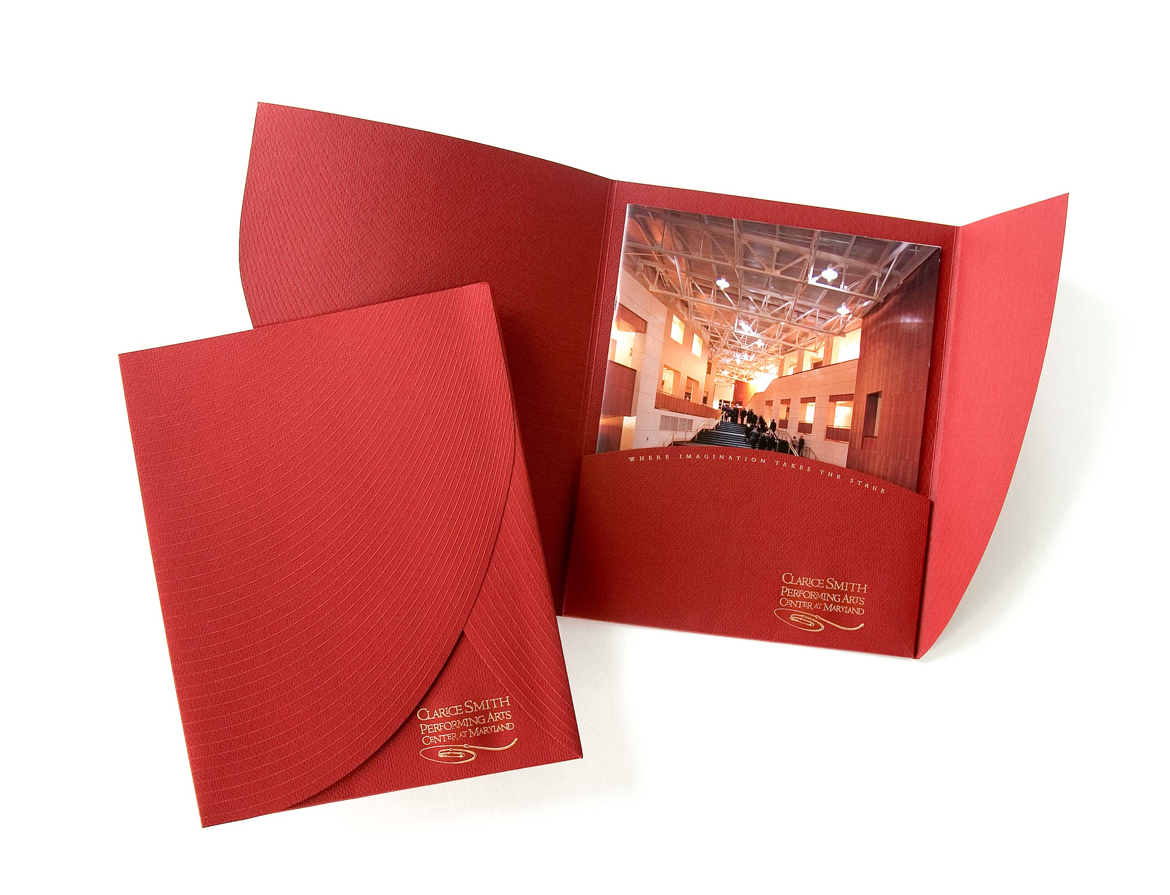
With construction of Maryland’s new performing arts center nearing completion, we developed this piece for prospective donors to highlight naming opportunities. Days after spaces were completed, our photographer went in with his camera to photograph them. Since many of the performance spaces are quite large, he often used an extremely wide-angle lense to capture the space.
Inspired by the curves in the photographs, I carried the curves into the brochure and its pocket folder. The folder, embossed with curved lines, opens like a set of curtains on a stage.
University of Maryland Admissions Pieces
Shortly after I started working at the University of Maryland, we began work on a set of recruiting materials that included search pieces (brochures sent to prospective students) viewbook, a welcome guide, and other brochures.
The materials from colleges and universities that flood prospective students' mailboxes often feature lovely photographs of students and campus a witty headline. Having previously worked at two other universities, I was all too familiar with the look. Maryland wanted something different.
I developed a fun, playful visual language that featured colorful hand-painted backgrounds and other design elements, and cutout photographs of students. Each element was photographed or scanned and could easily be used throughout the set of publications.
Later, we developed a piece that encouraged prospective students to visit campus in the summer. Data suggested that students who did so were more likely to apply and enroll at the university. Given that Maryland includes ”land,” we developed a brochure that promoted the university as a theme park. Visitors could ”ride the rides” and see various attractions while learning more about the university.


